DATA VISUALIZATION
Population Distribution
Location analytics reveal important shifts in population movement over time.
About the Dashboard
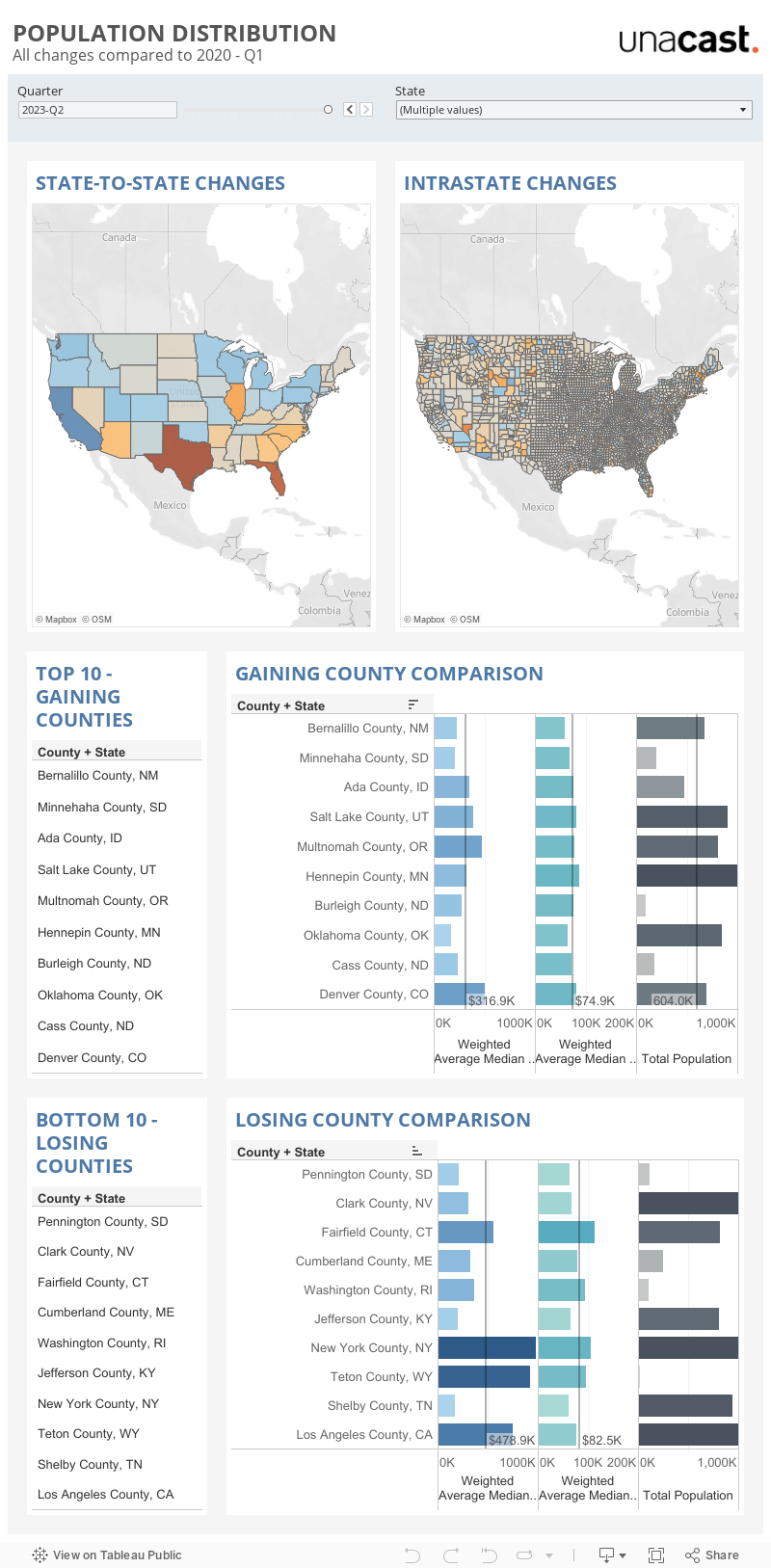
Gravy’s Population Distribution dashboard shows how the U.S. population has shifted since Q1 2020 in all 50 states and Washington, D.C. This visualization demonstrates how people have moved to and from individual states, as well as between the counties in each state. COVID-19 ushered in significant and most likely permanent changes to how today’s consumers live and work. Work-from-home policies, for example, have become commonplace at companies across industries. With employees no longer needing to live close to an office location, some workers chose to relocate. Others found new jobs (or careers) in a different area of the country or simply decided that it was time to retire. In any case, the last two years have been characterized by significant changes in population distribution and a real estate market frenzy.
What factors do people consider when they move to a different area? Is it a lower cost of living, a new job, or plenty of entertainment and dining options? Or is it some of all of the above? By enriching population distribution data with census data providing information about the local population size, income, and home prices, we can begin to understand why some places in the country are gaining residents while, at the same time, others are watching their populations shrink.
Gravy Observations can be used to gauge population distribution in any location around the world. Observations and related metrics, like population movement, are often used for real estate site selection. It can also be helpful to understand population changes to support infrastructure development and community planning. From a market research standpoint, population distribution is an important indicator of community desirability. This data can help municipalities better understand how their community compares to others at a local and national level.
Data Methodology
The population distribution data shown in this dashboard reflects real-world changes in the distribution of the U.S. population. To do so, it uses consumer mobile device signals observed in every county across the country. In total, Gravy processes more than 60B+ location signals from consumer mobile devices every day.
A device is recorded in a state or county when a majority of the signals associated with that device are in that state or county. The total number of unique devices observed in each state or in each county in a state is then divided by the total number of unique devices observed across all states or across all counties in a state. This yields the percentage of total devices within a state or county. Changes in population distribution are then calculated by finding the difference between the percentage of unique devices observed in an area in Q1 2020 and the selected quarter. The greater the difference (+/-) between the percentage of devices, the higher the population gain or loss. This dashboard is built on aggregated Observations data generated between Q1 2020 and the present day. It is updated quarterly with the most current population distribution data.
Use of Data for Media and Research Purposes
- If you are a journalist or researcher and would like to use this Population Distribution dashboard or data for media or research purposes, please let us know at info@gravyanalytics.com.
Get started with best-in-class data
All data presented in the dashboards is available on the Gravy Analytics platform.